In Web page design, the popularity of Adobe's Flash multimedia platform is nose-diving, while HTML5 is skyrocketing. That transition is causing websites and website designers to find better ways of incorporating motion and interactivity, and Adobe's new Dreamweaver CS6 ($399 as a stand-alone program, as of 6/1/2012; also part of Adobe's Creative Suite 6) provides an array of tools to serve up HTML5-based designs on smartphones, tablets, and desktops.
Fluid Layouts, Fluid Design
All website traffic is growing, but mobile website traffic is growing the most quickly. Dreamweaver CS6's new Fluid Grid Layout tool helps you design for devices of all screen sizes, from smartphone to tablet to desktop. The previous version of Dreamweaver helped you build "media queries"--code in a master HTML file to direct traffic from devices of different screen sizes to different CSS files--but it didn't provide much help in figuring out how to set up each of those CSS files for the different screens.
For a Fluid Grid Layout, you use a simple wizard to set how many columns you want for a smartphone, a tablet, and a desktop; indicate the size of the columns; and Dreamweaver creates the HTML5 file and an associated CSS3 file. Then you use a menu command to add containers for blocks of content and rearrange them on a grid. Dreamweaver takes care of the coding--at least, for a while; as with almost any Dreamweaver operation, you'll end up poring over the application's code view to make changes in your content. Adobe cautions against fiddling with the Fluid Grid Layout code--it's just too easy to screw it up. By the way, Adobe TV has excellent video walkthroughs of this new feature and of many others.
Fluid Grid Layouts are supposed to give you a starting point for an adaptive design. That is, you build your content once, and then the Web pages on which that content lives will reconfigure themselves to display the content properly on any size screen. This is known as adaptive design, and you can test it on any website by opening it in a desktop browser and then resizing the browser window, from smartphone size to standard desktop size. Does the content on the page just sit there as you resize, or does it reflow, based on the size of the window? If it reflows, then it's probably an HTML5-based site, and it will likely work well on any kind of device.
I found Fluid Grid Layouts easy enough to create, but I found that resizing the containers worked a little sluggishly, and the undo function frequently didn't work. Dreamweaver's interface has new, useful buttons at the bottom of its Design window that you can click on to show smartphone, tablet, and desktop screen viewports, and those are very helpful to see how your content will appear. Also, Dreamweaver's Live view is improved, in that the visual representation of what your Web page will look like in a real browser is closer to reality (but only closer to what webkit-based browsers--meaning, Safari and Chrome--will look like; Firefox and Internet Explorer may look dramatically different). Still, you can now make some changes in code while the Live view is enabled and see your changes reflected in the Design pane, something you couldn't do before.
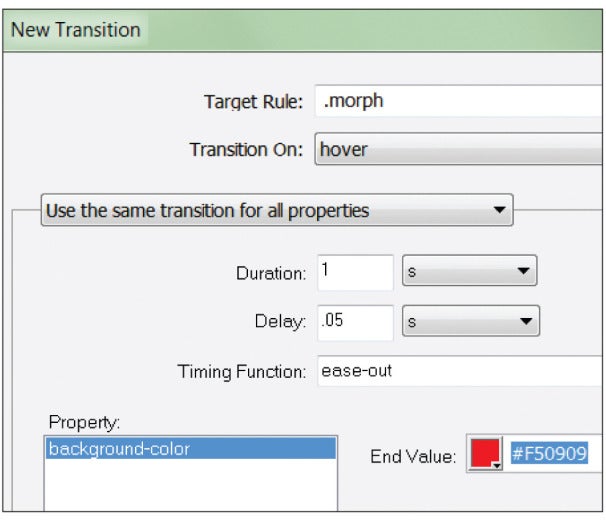
A new palette and associated dialog box help you create CSS Transitions, which are motion effects that do not require JavaScript (or Flash, of course). Once you've got down how they work, you can build spiffy actions, such as rollovers and other movements pretty simply. The code that Dreamweaver generates is simple, too, because the behaviors that it describes are taken care of by concise CSS3 code, not verbose JavaScript. Dreamweaver generates all of the browser-specific code that is necessary for browsers (old and new) to use this code; that is, every action that you set causes Dreamweaver to generate CSS code that’s easy to understand.
Instead of sticking with the standard, boring Ariel, Tahoma, and the like, which are built into all browsers and therefore are safe to specify in a Web page, you can buy or find for free fonts fromGoogle or other outfits, load them on your Web server, and then use Dreamweaver CS6's new Web Font Manager to apply them to your pages. That's great, but you must download the fonts to your own server, because the utility does not help you manage fonts that must be hosted externally, such as ones from Adobe's own TypeKit library, though Adobe says support for incorporating TypeKit fonts is coming soon. And Dreamweaver CS6 requires that you load the fonts one at a time into the Web Fonts Manager interface, and then you must add them to your Font Families list. Adobe says that's due to licensing issues, but I think the procedure still could have been made a little less cumbersome. To use the fonts, you select some text, then pick the font name from a CSS drop-down menu. Whether you use downloaded Web fonts or externally hosted ones on your site, you will see them render properly in Dreamweaver's Live view.
The App Is Where It's At
The previous version of Dreamweaver allowed users to build mobile applications (in addition to mobile websites), but doing so took some effort: You had to download the Android Software Developer's Kit (SDK) on your own, install it, then tell Dreamweaver where to find it. If you were trying to make an iOS app, you were out of luck, since Apple doesn't make an SDK that runs on Windows. Dreamweaver’s templates were few and boring, too.
Some
DOWNLOAD NOW


0 comments:
Post a Comment