Posted by Unknown On 11:01


Correct and enhance photos for maximum impact

Make every picture special with automated photo enhancements and easy-to-understand options for image editing and sharing.

Easy and Fast ExpressFix™ Mode

The unique ExpressFix panel features one-click fixes and enhancements. Easily compare changes with a large preview screen that shows Before and After views.
  • SmartCurves – automatically bring out details in dark areas, without overexposing the highlights
  • Auto White Balance Control – easily correct your images to make colors look natural under any kind of light
  • Reduce Noise – automatically clean up digital artifacts in photos shot in low light or at high ISO settings. Especially useful for improving cell phone pictures
  • Photo Project Wizard – easily create collages, comic strips, DVD labels and greeting cards

New! Next-generation Crop tools

PhotoImpact now offers 2 easy ways to re-compose your pictures for greater impact:
  • Rule of Thirds Crop – apply the classic Rule of Thirds grid for more dynamic images
  • Golden Ratio Crop – used throughout history by the masters, this is a timeless tool that creates a proportion that is aesthetically pleasing. It worked for the Mona Lisa, it can work for your photos, too!

SmartGuide "How-to" Help

  • Step-by-step directions on screen show you how to complete great-looking projects
  • Includes guides for basic and advanced photo-editing, Web page, video and DVD menu tasks
  • Links take you directly to the tools you need


Enhance photo details even more with advanced editing tools

PhotoImpact X3 includes a complete set of powerful tools to satisfy the demands of high-end users.

Powerful Retouching

Enhance your photos using advanced darkroom tools.
  • Dodge, Burn, Remove Scratch – retouch photos to improve quality and add professional-looking photographic effects
  • Touch-up Tool – Easily remove skin blemishes and unwanted image details and objects

Enhanced! RAW File Support

Brighter previews, improved performance and a greater number of supported camera models make working with your RAW images easier than ever.

High Dynamic Range

  • Create professional images that capture color and detail in both shadows and highlights
  • Remove elements of the scene that change between shots
  • Enhanced with preset curves for more camera models


Take your photos to new places

New! Photo Projects

  • Share your photos as greetings cards, collages, comic strips, and on CD & DVD labels
  • Choose from 70 customizable templates
  • Follow the simple and fast 3-step wizard to complete projects quickly

Enhanced! COOL 360 Panorama-maker

  • Now fully integrated into PhotoImpact
  • Seamlessly combine a series of photos
  • Create horizontal or even vertical panoramas


Create amazing digital art

Enjoy limitless creative possibilities with PhotoImpact's suite of powerful, easy-to-use image-editing tools.

New & Unique! Cloud Pen

  • Say goodbye to dull skies! Now you can paint natural-looking clouds or add fun effects
  • Choose from cumulus, cirrus and stratus cloud types
  • Get creative with fantasy cloud animals, skywriting or smoke signals

SPECIAL OFFER! Corel® Painter™ Essentials 3 (full version)

  • A complete home art studio, for novices and experts alike
  • Draw or paint original artwork, or enhance your photos with paint effects
  • Natural-Media® watercolor and oil-paint brushes behave just like the real thing!
  • Automatically turn your photos of kids, travel or weddings into stunning paintings in 3 easy steps!

Creative Photographic Filters

Choose from hundreds of optical effects, textures and lighting effects to add flair to your photos.


Discover graphics tools for video enthusiasts

Make your video productions stand out by creating stunning graphics for slide shows, videos, DVDs and more.

New! Slideshow Prep Wizard

  • Make sure your photos look their best in a DVD slide show
  • Choose from a selection of sophisticated frames, drop-shadow and color-gradient background styles
  • Add date/time labels and batch process
  • Import your photos into Corel® VideoStudio® or Corel® DVD MovieFactory® to easily create your slide show. PhotoImpact X3 is a great companion tool for these video-editing and DVD authoring applications

New! DVD Content Sets

Present your video projects like a pro. Design and print DVD labels and case covers that match menus in DVD MovieFactory and VideoStudio.

Save Images for Video

Generate GIF & PNG images with transparency for video overlays, logos or lower-thirds.

DVD Menu Maker Plug-in

Create DVD menus for DVD MovieFactory 5 or 6, and VideoStudio 10 or 11.


DOWNLOAD NOW
Posted by Unknown On 10:52


Ulead PhotoImpact 12 is a complete image-editing suite. Choose powerful yet easy-to-use tools and share in your photos, greeting cards, labels, calendars, prints, e-mail. ExpressFix mode is perfect for beginners to get started fast. One-click fixes and enhancements make it great for anyone. Powerful, high-end image editing new Auto White Balance Control makes colors look natural. Enhanced RAW file & 16-bit image support. Features complete Creative Suite for greeting cards and CD & DVD labels design, advanced painting, drawing, cloning, and retouching tools, exciting 2D & 3D text and graphics, and dozens of professional filters. Web, DVD,and Video Graphics Create tailor-made DVD menu buttons, Web and video objects. DVD Menu Maker Plug-in lets you make custom DVD menus.

DOWNLOAD NOW
Posted by Unknown On 10:49


There should be no doubt that Apple's decision to block Flash from iOS in favor of HTML5 has spurred Adobe to make sure that its media-rich content-building tool and player Flash remains competitive. Flash Player 11 brings hardware-accelerated graphics support to the platform.
According to Adobe, the new Stage3D technology in the new Flash Player brings combined 2D and 3D acceleration that is up to 1,000 times faster than the previous Flash iterations. While currently Stage3D is supported only for personal computers, it should make its way to mobile devices in future Flash releases. The advancements offered by Stage3D should bring far more complex graphics development for the player, and allow some developers to use it as a viable alternative for their projects, especially for cross-platform efforts.
In addition to accelerated graphics, Flash 11 now is natively in 64-bit code on all supported platforms, which will allow it to better integrate with browsers and plug-ins that are coded in 64-bit. This along with a slew of new enhancements for developers in terms of security improvements, media handling, and better JavaScript integration will enhance the player's use for future development. Flash also comes baked into Google Chrome, and therefore the Chrome OS that powers Google's Chromebooks.
Mac users take note: Flash requires OS X 10.6 or later running on an Intel platform since Adobe removed support for PowerPC Macs in Flash 10.
Although it's possible that HTML5 will at some point unseat Flash as the dominant code for media on the Web, that won't happen for a while yet since HTML5 standards haven't even been finalized. The Flash Player is a must if you want to experience the Web at its fullest, so users at any level of expertise should have no qualms about installing or upgrading.
 
DOWNLOAD NOW

Posted by Unknown On 10:44


Photographers don't just need to edit photos, they need some way of organising them too. You can use a folder browsing program like Adobe Bridge or, if you have one of the most recent versions of Photoshop Elements, you might be using the Elements Organizer.
But Lightroom is an attempt to bring these two functions together, so that you can both organise your photos and edit them within a single application.
Lightroom's image adjustments are non-destructive. They're stored within the photo library and associated with the relevant pictures rather than being applied to them directly. This is the approach taken by Apple's own Lightroom rival, Aperture.

Under the hood

Lightroom 4
Lightroom 4 looks very much like Lightroom 3 at first glance, but there have been some important changes. These include redesigned and improved image-editing tools, integrated photo books, a new Maps module for locating your photos on a map, basic video editing and enhancement tools, 'soft-proofing' for checking how your photos will look in different output devices and various other improvements.
The image processing engine is new, and Adobe has swapped the old Recovery and Fill Light sliders for Whites and Shadows. These aren't direct replacements, exactly, but they're the nearest equivalents, and much improved.
Now, when you recover highlights with the Whites slider, there's far less impact on the tones in the rest of the image. Likewise, the Shadows slider recovers dark shadow detail without over-lightening the whole picture.
Lightroom 4 brings new localised adjustment tools too. It's now possible to 'paint' white balance, noise reduction and anti-moire effects on to areas of the image, in addition to existing tone and colour modifications.
Lightroom 4
In the 'soft-proofing' mode, you can check how your images will appear when they're printed on devices with a different colour gamut, like different models of desktop printer or types of paper. 'Out of gamut' colours are highlighted in red, and you can adjust either the saturation or the hue of these particular colours to bring them back in range.
Soft proofing doesn't enable you to get more colours out of your printer, but it does let you see what will happen and control the outcome more effectively.
Adobe has added basic video support, too. Lightroom 4 won't replace your video-editing app, but it does let you trim and clean up your video clips so that you're starting with better raw materials. You can even apply a range of Lightroom enhancements and presets via the Quick Edit panel.
Not all of the regular Lightroom adjustments can be used with video, but it displays a dialog with checkboxes against the adjustments that will be applied. For example, you can apply colour adjustments to match up clips shot in slightly different lighting, or apply a warm, retro look from the range of presets available. Clips can also be exported as H.264 files, or uploaded directly to Facebook or Flickr.
Lightroom 4
The new Map module works just as you'd expect if you've used similar tools in Aperture, iPhoto or on Flickr. Images which have location information embedded in the EXIF data show up on pins on the map, and images which don't have this data can be added to maps manually - they're now 'retro-tagged' with this information and show up on maps.
Lightroom 4's mapping tools are straightforward to use, and have extra features, such as the ability to create favourite 'locations', which are broader, user-defined areas containing a number of different shooting locations. And you can use Lightroom's filtering tools, displayed as a series of columns at the top of the Grid view, to filter photos in a Collection or a folder by their location.

What's the Blurb?

Lightroom 4
The new Book module is provided by Blurb, one of the better-known online photo book suppliers, and offers both pre-designed books and the ability to create your own layouts. It's much better than struggling with standalone apps or online book creation tools, and you can keep track of your books from within Lightroom.
Adobe's also introduced new options for its DNG file format, a 'universal' RAW format designed to replace the multiplicity of different camera RAW files, though so far Adobe seems to be the only software publisher putting much weight behind it. You can now 'group' related images together in Collections. Previously, this was only possible in folders, which was an unexpected limitation.
Lightroom still separates folders and Collections (albums) in the same rather awkward way, though. Folders are displayed in one panel, but Collections are created and managed in a different one. You might create a Collection of images from within a Folder, but they're not listed in the same panel and they are, as far as Lighroom is concerned, unrelated.
The interface remains quite dark and cluttered too, and Lightroom can feel sluggish when you're scrolling through large numbers of images. This is where Lightroom 4 still feels slightly inferior to Aperture, it's chief rival.

You can compare the features as much as you like, but in the end it's a very subjective thing. Lightroom 4 ticks all the boxes, and if you liked version 3 then it's an important upgrade. But its appearance and way of working are different to Aperture's and you need to try both before deciding which one's best for you.Lightroom's editing tools are more comprehensive, but Aperture is still the fastest and most effective at browsing and organising. Lightroom is more transparent about how it manages the files on your hard disk, but Aperture has the option to store original images internally in a single library file that's easy to keep track of.


 DOWNLOAD NOW
Posted by Unknown On 10:38


The new InDesign CS6 shows Adobe's commitment to design and page layout. The new features InDesign boasts are intended to make life easier for busy layout production work and also for anyone making page designs for more than one final format.
Everyone in the DTP field is being asked to do more kinds of work than ever before - and not just taking pages onto iPads, although that's definitely something we hear regularly.
Repurposing layouts into new page sizes is where the Liquid Layout feature comes in handy. This lets pages be reshaped and the contents adjust, slide or resize to fit into the new dimensions. It's a strange thing to see, but it works well - and much better than the Layout Adjustment feature that's been around in previous InDesign versions.
You use the Liquid Layout window to tell objects whether they should grow, be pinned to sides of the page, or simply do an 'auto fit' that leaves the decisions up to InDesign. Then use the Page Tool to pull the page into a different shape. This way you can preview how things will change when the document is resized, or when a new 'alternate layout' is made from the current one.


Alternate layouts finally make iPad layouts a little easier to manage. These put different layout page sizes into the same document. You can choose which set of pages to see, or show more than one set at once by splitting the window. The Pages palette shows the different layouts in a document. If you need to make multiple versions of a layout, this is great news. But watch out, if you add a page into one layout it isn't automatically added into the other: there is no synchronisation.
The Content Collector is another powerhouse trick for busy production staff. Choose this tool - the only new icon in the Tools palette - to show the Content Collector window, then click on items to add them to it.
Switch to the Content Placer tool and you can place them back on the page in the order they were collected. This is perfect for copying lots of items from one document or layout to another. They don't stay in the Content Collector when they're placed again, so this feature doesn't replace the Library for storing master copies of items. Think of it as visual copy and paste on steroids.
Another new feature is the ability to insert HTML content as objects into a page layout. This means more options for making iPad folio documents or EPUB books, but not so much for print work. Exporting to PDF with HTML items in a layout created black boxes in our tests, even with simple text. It also didn't let us put more than one portion of HTML into a document at once: every HTML item ended up with the same content.
More impressive is the ability to make PDF forms from inside InDesign CS6. It is actually easier to make them here than in Acrobat Pro, although it is still something you will need to take time to understand.
Indesign cs6
Select an item and use the Buttons and Forms palette window to set up the form item type and behaviour. Text boxes can be turned into form fields, even password ones, and graphic buttons and checkboxes can be set.
Teething bugs aside, InDesign CS6 seems to be a robust and useful upgrade. If you don't specifically need the key update features then you probably shouldn't get too excited about this. But if you do, well, they should make your life much easier - once you get your head around how to use them properly.


DOWNLOAD NOW
Posted by Unknown On 10:31


In Web page design, the popularity of Adobe's Flash multimedia platform is nose-diving, while HTML5 is skyrocketing. That transition is causing websites and website designers to find better ways of incorporating motion and interactivity, and Adobe's new Dreamweaver CS6 ($399 as a stand-alone program, as of 6/1/2012; also part of Adobe's Creative Suite 6) provides an array of tools to serve up HTML5-based designs on smartphones, tablets, and desktops.

Fluid Layouts, Fluid Design

All website traffic is growing, but mobile website traffic is growing the most quickly. Dreamweaver CS6's new Fluid Grid Layout tool helps you design for devices of all screen sizes, from smartphone to tablet to desktop. The previous version of Dreamweaver helped you build "media queries"--code in a master HTML file to direct traffic from devices of different screen sizes to different CSS files--but it didn't provide much help in figuring out how to set up each of those CSS files for the different screens.
For a Fluid Grid Layout, you use a simple wizard to set how many columns you want for a smartphone, a tablet, and a desktop; indicate the size of the columns; and Dreamweaver creates the HTML5 file and an associated CSS3 file. Then you use a menu command to add containers for blocks of content and rearrange them on a grid. Dreamweaver takes care of the coding--at least, for a while; as with almost any Dreamweaver operation, you'll end up poring over the application's code view to make changes in your content. Adobe cautions against fiddling with the Fluid Grid Layout code--it's just too easy to screw it up. By the way, Adobe TV has excellent video walkthroughs of this new feature and of many others.
Fluid Grid Layouts are supposed to give you a starting point for an adaptive design. That is, you build your content once, and then the Web pages on which that content lives will reconfigure themselves to display the content properly on any size screen. This is known as adaptive design, and you can test it on any website by opening it in a desktop browser and then resizing the browser window, from smartphone size to standard desktop size. Does the content on the page just sit there as you resize, or does it reflow, based on the size of the window? If it reflows, then it's probably an HTML5-based site, and it will likely work well on any kind of device.
I found Fluid Grid Layouts easy enough to create, but I found that resizing the containers worked a little sluggishly, and the undo function frequently didn't work. Dreamweaver's interface has new, useful buttons at the bottom of its Design window that you can click on to show smartphone, tablet, and desktop screen viewports, and those are very helpful to see how your content will appear. Also, Dreamweaver's Live view is improved, in that the visual representation of what your Web page will look like in a real browser is closer to reality (but only closer to what webkit-based browsers--meaning, Safari and Chrome--will look like; Firefox and Internet Explorer may look dramatically different). Still, you can now make some changes in code while the Live view is enabled and see your changes reflected in the Design pane, something you couldn't do before.
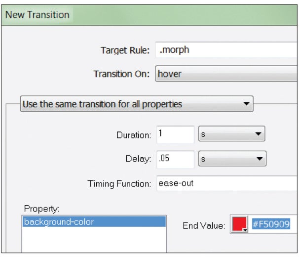
Dialog box for new CSS Transitions tool.A new palette and associated dialog box help you create CSS Transitions, which are motion effects that do not require JavaScript (or Flash, of course). Once you've got down how they work, you can build spiffy actions, such as rollovers and other movements pretty simply. The code that Dreamweaver generates is simple, too, because the behaviors that it describes are taken care of by concise CSS3 code, not verbose JavaScript. Dreamweaver generates all of the browser-specific code that is necessary for browsers (old and new) to use this code; that is, every action that you set causes Dreamweaver to generate CSS code that’s easy to understand.
Instead of sticking with the standard, boring Ariel, Tahoma, and the like, which are built into all browsers and therefore are safe to specify in a Web page, you can buy or find for free fonts fromGoogle or other outfits, load them on your Web server, and then use Dreamweaver CS6's new Web Font Manager to apply them to your pages. That's great, but you must download the fonts to your own server, because the utility does not help you manage fonts that must be hosted externally, such as ones from Adobe's own TypeKit library, though Adobe says support for incorporating TypeKit fonts is coming soon. And Dreamweaver CS6 requires that you load the fonts one at a time into the Web Fonts Manager interface, and then you must add them to your Font Families list. Adobe says that's due to licensing issues, but I think the procedure still could have been made a little less cumbersome. To use the fonts, you select some text, then pick the font name from a CSS drop-down menu. Whether you use downloaded Web fonts or externally hosted ones on your site, you will see them render properly in Dreamweaver's Live view.

The App Is Where It's At

The previous version of Dreamweaver allowed users to build mobile applications (in addition to mobile websites), but doing so took some effort: You had to download the Android Software Developer's Kit (SDK) on your own, install it, then tell Dreamweaver where to find it. If you were trying to make an iOS app, you were out of luck, since Apple doesn't make an SDK that runs on Windows. Dreamweaver’s templates were few and boring, too.
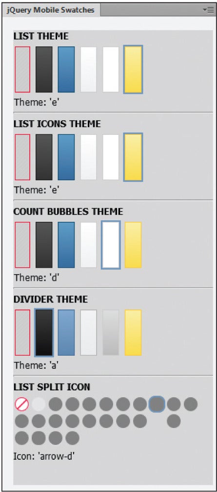
A jQuery swatch panel for designing buttons.Some

DOWNLOAD NOW
Posted by Unknown On 10:25


Adobe’s new top-of-the-range Acrobat X Pro builds on Acrobat X Standard, which itself builds on Reader X. As such, it inherits all the advances of the whole range, such as the enhanced interface, Reading mode, SendNow integration and SharePoint support.
Again like Standard, Acrobat X Pro’s existing power is now mostly accessed through the new Tools task pane. This makes it easier to find functions, but it also highlights just how much power Pro offers, with options covering everything from XML-based forms creation through to colour-separated commercial print.
Packing in as much PDF-based power as possible is Acrobat Pro’s mission, but the sheer range and depth is intimidating. Worse, each advanced workflow is complex, meaning it can be a real challenge to get everything right every time – if you don’t, it can be a real disaster. With Acrobat X Pro, Adobe tries to help users get on top of their workflows with the introduction of actions.
Adobe Acrobat X Pro
Seven preset actions cover such common tasks as archiving paper documents and preparing for web distribution. Click on the Publish Sensitive Document wizard, for example, and it walks you through marking up the document for redaction (a Pro-only feature), removing hidden information and general file optimisation. It’s also simple to edit existing actions – say to add a step for password-based encryption – and to create your own from scratch.
Acrobat X Pro isn’t just intended to let you do more with your PDFs; its main function is to enable others to get more out of the PDFs you produce. Key to this, and perhaps the program’s greatest strength, is its ability to unlock power in the free Reader X to enable anyone to fill in forms and digitally sign documents. The biggest advance is in unlocking all commenting capabilities in Reader X’s Comments pane, so anyone can participate in a shared review.
As well as making the Reader program richer, Acrobat X Pro users can add content such as maps and 3D to their PDFs. It’s worth noting here that, while Acrobat X Pro still lets you import 3D models in U3D format, the former Acrobat 9 Pro Extended has been discontinued. Its advanced 3D capabilities are to be handled as a third-party add-on


DOWNLOAD NOW
Posted by Unknown On 10:17


TO DOWNLOAD CLICK HERE

Posted by Unknown On 10:08


Adobe Illustrator has long been the choice for illustration professionals, designers, and anyone who wants to work with infinitely scalable vector graphics. Over the years it’s gained some highly impressive features, such as mesh tools for drawing photorealistic objects, perspective tools for taking the pain out of vanishing points, and much, much more. So, what can CS6 bring? Oh, just plenty of new features and an all-new interface.

The charcoal-gray interface, like Photoshop’s by default, gives Illustrator a more refined, professional feel. If it’s a little much, you can change the interface color via Preferences (unlike Photoshop’s theme-based approach). It’s a minor, but lovely touch. But the real thing you notice about Illustrator is its blazing fast speed. Mainly thanks to the Mercury Performance System and native 64-bit support, complex documents with meshes, gradients, and many points can be manipulated with relative ease. Redraw certainly seems snappier as well.
Designers will love the easy-to-use, extremely powerful pattern tools. 

Beyond the speed improvements, Illustrator brings new and improved features to the table. The most notable is undoubtedly the new pattern creation tools. Creating a tiled pattern and editing it is now extremely easy: open or draw an object that you want to be repeated and then go to Object > Pattern > Make. Your object then repeats on the art board. The Pattern Options panel lets you control the pattern, with a really handy slider enabling you to dim your instances so you can work on and edit the original object. As you edit, the repeats update. The pattern is automatically added to the Swatches panel and updates when you click Done in pattern creation mode. You can choose to save a copy to add another swatch to the Swatches panel. But the best thing? Double-clicking the swatch in the Swatches panel lets you go back to edit the pattern. When you update it, it updates any object the pattern is applied to. It’s quite brilliant, and textile artists, designers, and illustrators who use patterns will absolutely love it.

The other big feature is the removal of Live Trace--it’s been replaced with a new bitmap tracing engine called Image Trace. Now, don’t expect this to magically turn any photos into vector artwork, but it does a pretty good job. And you have more options for tracing than ever before. The tool is controlled by the context-sensitive Control panel or the new Image Trace panel, and you can apply presets or tweak settings manually. Image Trace is a powerful replacement for the often hit-and-miss Live Trace, and when you do need it, it comes in very handy.
Image Trace is a replacement for Live Trace, and admirably turns bitmaps into vector art.

The final addition of note is the ability to add gradients to strokes. We don’t know why this wasn’t in previous versions, but it’s a welcome addition, especially for those designing photorealistic vector artwork. There’s also some tweaks to the Gaussian Blur effect and minor panel updates, including a Scale Strokes & Effects checkbox added to the Transform panel.

The bottom line. Illustrator remains hugely powerful, and a tool that is reliable, fast (as long as you have a good amount of RAM), and pretty much vital to any creative pro. The new pattern creation features are a joy to use, and the speed of this version alone will impress any daily user of the app.


TO DOWNLOAD CLICK HERE